Navigating Kochi — Designing a City Signage & Wayfinding System

Navigating Kochi — Designing a City Signage & Wayfinding System

FIRM:

FIRM:

DESIGN DIFFERENCE, KOcHI

DESIGN DIFFERENCE, KOcHI

ROLE:

ROLE:

GRAPHIC DESIGNER

GRAPHIC DESIGNER

WHEN:

WHEN:

2009

2009

Aimed to bring order to a visually fragmented cityscape—using design to make everyday movement intuitive, inclusive, and culturally grounded.

Aimed to bring order to a visually fragmented cityscape—using design to make everyday movement intuitive, inclusive, and culturally grounded.

This project aimed to bring order to a visually fragmented cityscape—using design to make everyday movement intuitive, inclusive, and culturally grounded.
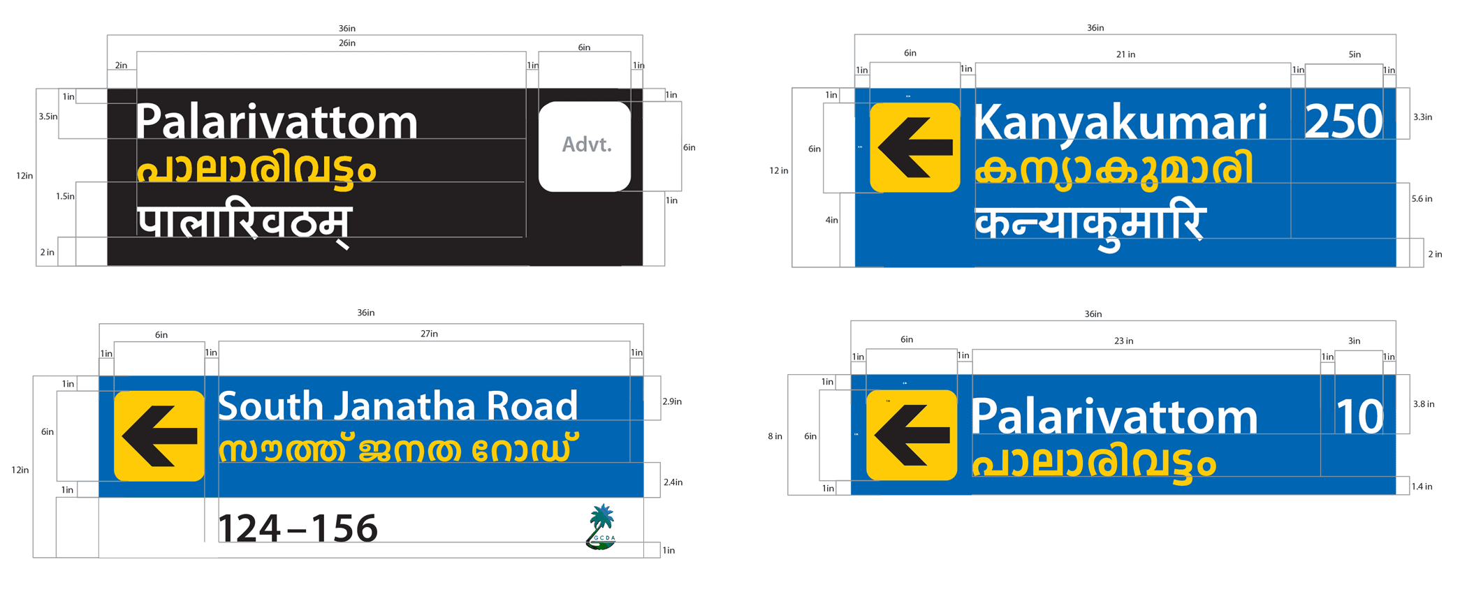
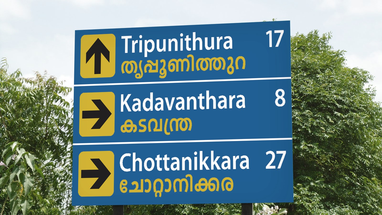
In 2009, I worked on a civic design project for the Greater Cochin Development Authority. The intent was clear: improve how residents and visitors navigate the city by creating a unified signage and wayfinding system rooted in local identity.

A city is only as accessible as its signage allows


A city is only as accessible as its signage allows
Inspired by transit design, we treated city navigation like a flow system


Kochi was rich in culture but poor in navigability. The existing signage and map systems were inconsistent, cluttered, and hard to follow—especially for tourists. The goal: build a coherent signage and wayfinding system that reflected the spirit of Kochi while making it easier to get around.

The redesign of the city map borrowed cues from Harry Beck’s London Tube Map:

  • NH 47 was used as the spine for spatial orientation

  • All roads, railways, and junctions were aligned to vertical, diagonal, or horizontal logic

  • Color-coded routes and custom icons simplified identification of key areas

The result was a city guide that was not only usable, but actually inviting.

Inspired by transit design, we treated city navigation like a flow system

Kochi was rich in culture but poor in navigability. The existing signage and map systems were inconsistent, cluttered, and hard to follow—especially for tourists. The goal: build a coherent signage and wayfinding system that reflected the spirit of Kochi while making it easier to get around.

The redesign of the city map borrowed cues from Harry Beck’s London Tube Map:

  • NH 47 was used as the spine for spatial orientation

  • All roads, railways, and junctions were aligned to vertical, diagonal, or horizontal logic

  • Color-coded routes and custom icons simplified identification of key areas

The result was a city guide that was not only usable, but actually inviting.

Systematizing Signage: From Clutter to Clarity

Systematizing Signage: From Clutter to Clarity

Kochi was rich in culture but poor in navigability. The existing signage and map systems were inconsistent, cluttered, and hard to follow—especially for tourists. The goal: build a coherent signage and wayfinding system that reflected the spirit of Kochi while making it easier to get around.

Designing for a city showed me how information design can directly impact behavior.

This project taught me how to simplify complexity, think in systems, and root visual design in user context. It remains one of the most grounding experiences in my design journey—shaping my approach to both product and environmental design