Redesigning The Economic Times for the Contemporary Business Reader

Redesigning The Economic Times for the Contemporary Business Reader

INDUSTRY:

INDUSTRY:

EDITORIAL

EDITORIAL

FIRM:

FIRM:

ITU CHAUDHURI DESIF+GN

ITU CHAUDHURI DESIF+GN

ROLE:

ROLE:

GRAPHIC & EDITORIAL DESIGNER

GRAPHIC & EDITORIAL DESIGNER

WHEN:

WHEN:

2011

2011

Once a category leader, ET’s shift toward populist design elements created more confusion than connection. Legacy and new features clashed, undermining trust. The redesign brought back order—through clean typography, structured layouts, and a unified visual system—making the paper relevant to today’s business readers..

The design objective was thus to restore harmony and order and ‘look the leader’. Headline fonts were paired, one for the serious side of its image and another for its less formal side. The body font was selected for maximum economy without sacrificing legibility, after careful comparison of candidates. The graphics style was totally reworked to eliminate illustrated clutter.

Not younger looking but well-organised and contemporary
Younger readers didn’t want a “youthful” paper—they wanted one that felt efficient, modern, and easy to navigate.

Younger readers didn’t want a “youthful” paper—they wanted one that felt efficient, modern, and easy to navigate.

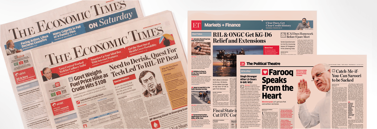
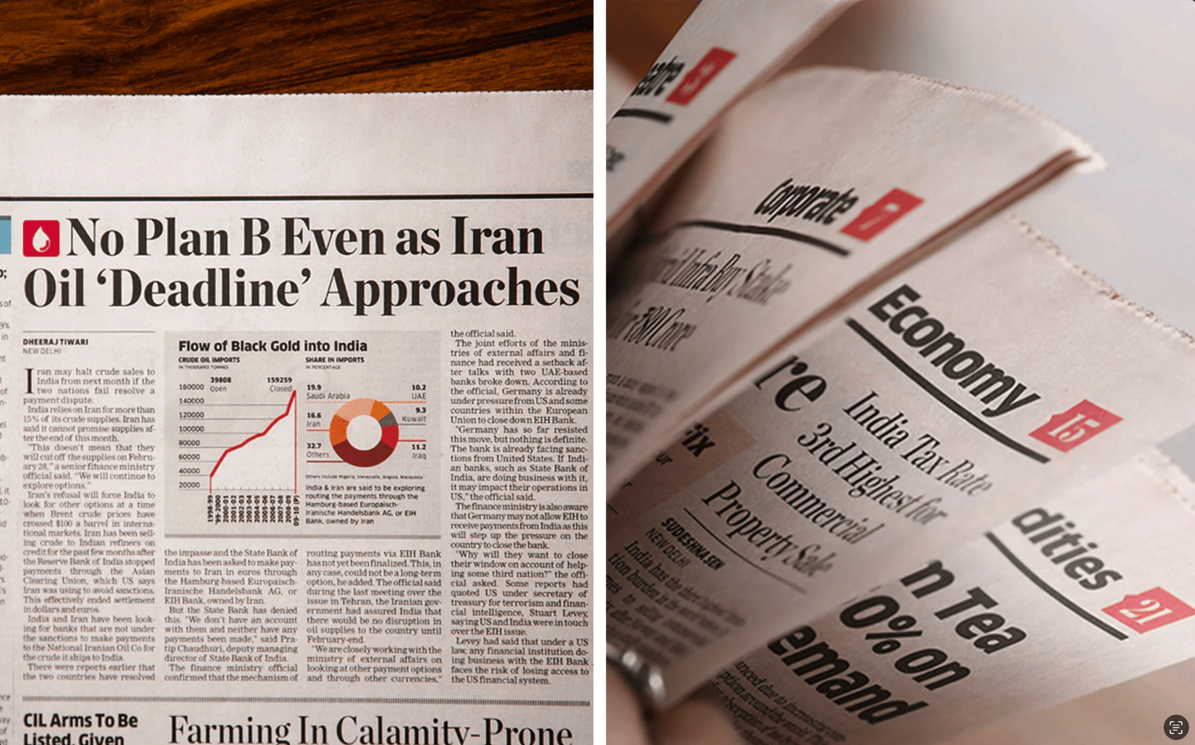
Rather than chasing trends, The Economic Times redesign focused on reflecting readers’ aspirations for clarity and efficiency. The cluttered layout was streamlined, graphics reworked to deliver insights, and color used systematically to guide the eye. Designed for skimming and depth alike, the revamp reestablished ET’s authority while appealing to both new and loyal readers.

Restore harmony and order, and ‘look the leader’

User conversations revealed that a trendy or playful design wouldn’t win over younger readers. What they valued was a paper that mirrored their need for clarity, efficiency, and structure—traits also appreciated by older loyalists.

The redesign addressed this by simplifying the layout, rationalizing the visual clutter, and creating a graphic system that emphasized conclusions over raw data.

Turning Data into Insightful Visuals
Every data point was redesigned to tell a story—infographics replaced raw charts, making insights quicker to grasp and more engaging to read.

In the redesign, raw data was no longer treated as filler—it became a storytelling tool. Each chart, graph, and table was reimagined as an infographic, designed to deliver quick, meaningful takeaways rather than just visualize numbers.

Visual clutter was removed, labels were made direct and readable, and design cues—like icons, highlights, and hierarchy—helped guide the reader’s eye to the conclusion. This shift encouraged editors to present interpretations upfront, aligning with the needs of modern readers who seek fast, actionable insight rather than dense data.

Designing for young learners means designing for two audiences: the child and the parent.

In 2018, we partnered with Disney to build a product for early learners (K3). The vision was playful and bold—mix gamification with core learning principles. While Anand Ramachandran led the overall strategy, I focused on ensuring the user experience was intuitive and joyful for 5–7-year-olds.

Here’s the twist: kids don’t buy or configure learning apps—parents do. And they often hover, checking in from behind the shoulder. We designed the experience to work even from that "overhead view," making learning feel safe, visible, and delightful.

Working under Itu Chaudhuri was where I truly learned to see type—how the right pairing, weight, and spacing could shape tone and clarity. It was also where I first grasped the power of grid systems—not just as layout tools, but as the backbone of scalable, consistent design.

These lessons in gridding and visual rhythm later became my strongest assets when designing responsive web and mobile experiences. The thoughtful use of subtle color to guide attention, not distract, was another key learning—one that continues to influence how I design for clarity and intent today.