CommonFloor Communities - Designing for First-Time Digital Admins

CommonFloor Communities - Designing for First-Time Digital Admins

INDUSTRY:

INDUSTRY:

PROP TECH

PROP TECH

FIRM:

FIRM:

COMMONFLOOR.COM (Acq. Quickr Homes)

COMMONFLOOR.COM (Acq. Quickr Homes)

ROLE:

ROLE:

UX DESIGN LEAD

UX DESIGN LEAD

WHEN:

WHEN:

2013

2013

This was one of my earliest deep dives into user-centered systems—where empathy, UX rigour, and cross-platform thinking became non-negotiable.

This was one of my earliest deep dives into user-centered systems—where empathy, UX rigour, and cross-platform thinking became non-negotiable.

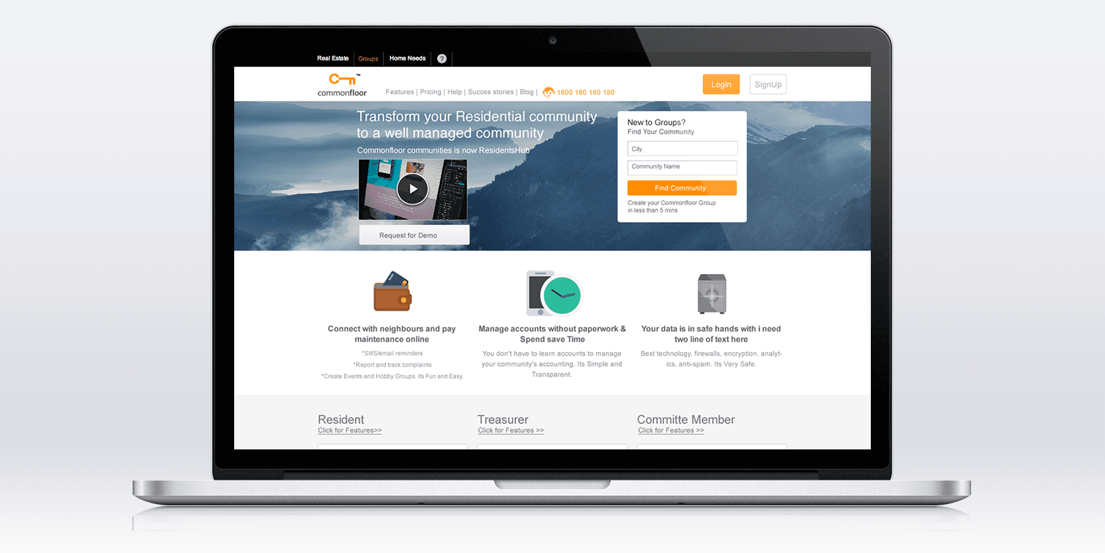
In 2013, I joined CommonFloor to lead UX for Communities—a platform built to help residents and administrators manage apartment societies online. While the goal was clear (replace noticeboards and ledgers with a digital dashboard), the challenge was more nuanced: most admins were over 40, non-technical, and transitioning to computers for the first time. The success of the product hinged on design that felt familiar, forgiving, and empowering—on both web and mobile.

Understanding the Users: Admins, Not Just Residents
Designing for digital newcomers means leaving assumptions at the door.

Designing for digital newcomers means leaving assumptions at the door.

The product wasn’t just for tech-savvy residents—it had to work for those managing the community: retired professionals, homemakers, senior citizens. Most were new to digital tools, shifting from ledgers and handwritten notes to screens for the first time.often volunteers who had previously managed society operations through physical ledgers, handwritten notices, or Excel files on shared computers. Many were hesitant about technology, worried they might 'break' the system or press the wrong button. For them, the idea of transitioning to a fully digital platform was as much about confidence as it was about usability.

We ran on-ground interviews across Bangalore, visited societies, and tested early prototypes. Common feedback:

  • "Too many buttons."

  • "I’m scared I’ll mess something up."

  • "This is harder than using my bank passbook."

This feedback reshaped our approach. We prioritized visual clarity, icon-driven navigation, and large interactive zones for slower, deliberate interaction.

Designing the Admin Panel: Simplicity at Scale
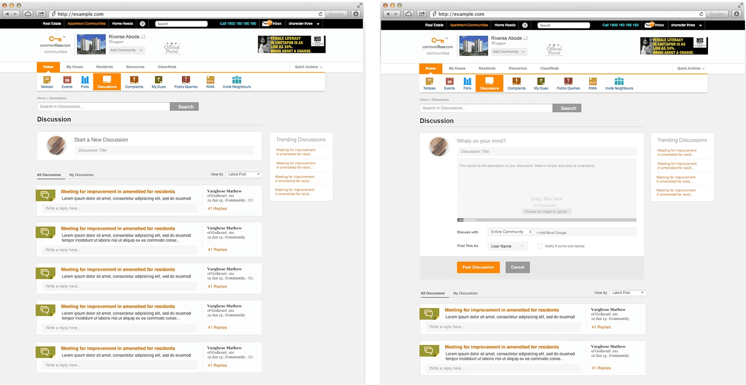
The admin panel became the nerve center—and it had to be dead simple

We used:

  • Swim lane experience mapping to break down user flows

  • Heatmaps and usage analytics to understand real interactions

  • First-time user guidance, inspired by onboarding models from platforms like Facebook and Quora

Post-launch, we saw a 75% increase in page views and 100% drop in bounce rate for first-time users. That meant users were not just signing up—they were staying, exploring, and using the product meaningfully.

Extending to Mobile: A Resident-First Companion
With 20% of users trying to access via mobile, we knew we had to meet them where they were.

I initiated and led the design of a mobile companion app, focusing on the resident experience. Through usage analytics and stakeholder pitching, we scoped the app to support:

  • Discussions, complaints, polls, notices, and payments

  • simplified interface modeled on popular consumer apps

  • Onboarding flows that guided users from their inbox to first interaction

Wireframes were built and validated through user testing, and visual branding was kept aligned with the web experience. The mobile app significantly improved engagement, especially among younger residents.

Designing for young learners means designing for two audiences: the child and the parent.

In 2018, we partnered with Disney to build a product for early learners (K3). The vision was playful and bold—mix gamification with core learning principles. While Anand Ramachandran led the overall strategy, I focused on ensuring the user experience was intuitive and joyful for 5–7-year-olds.

Here’s the twist: kids don’t buy or configure learning apps—parents do. And they often hover, checking in from behind the shoulder. We designed the experience to work even from that "overhead view," making learning feel safe, visible, and delightful.

Designing for people new to tech is humbling—and deeply rewarding

This project taught me to meet users where they are, not where we assume they should be. It showed me the power of research, the importance of clarity, and the role design plays in enabling comfort and confidence in digital spaces—whether through a desktop admin panel or a resident’s mobile app.